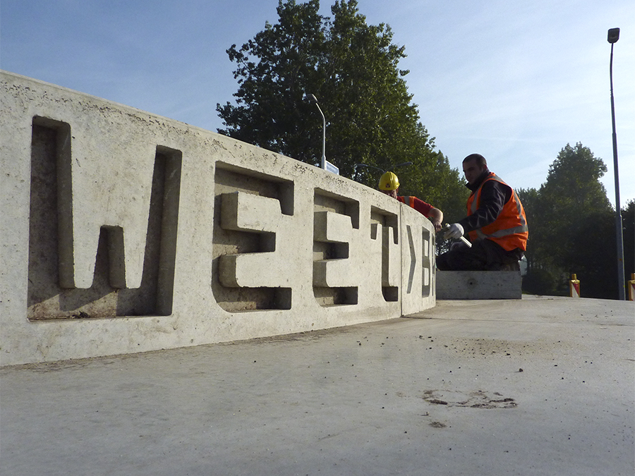
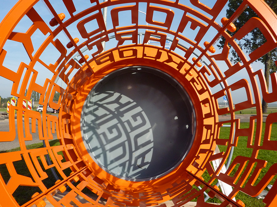
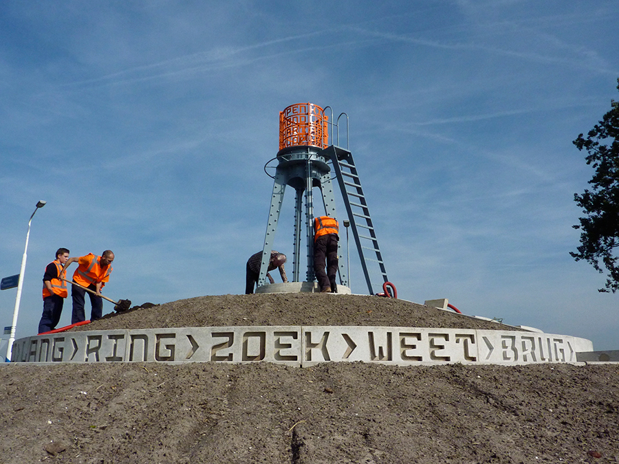
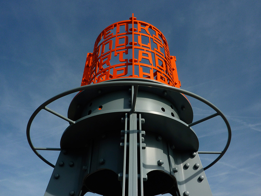
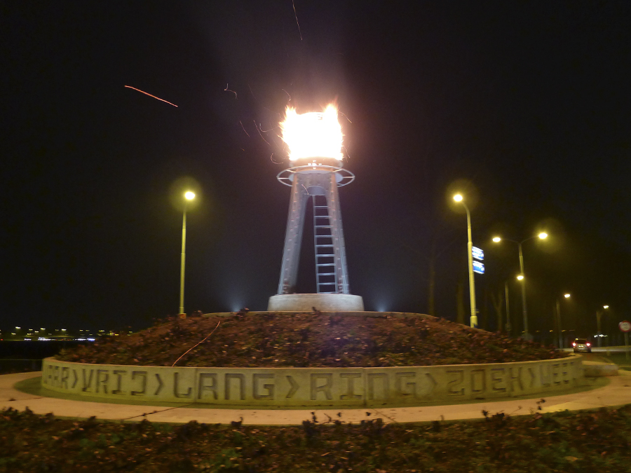
Concrete
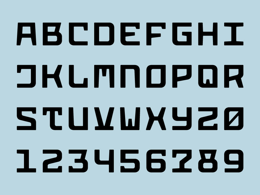
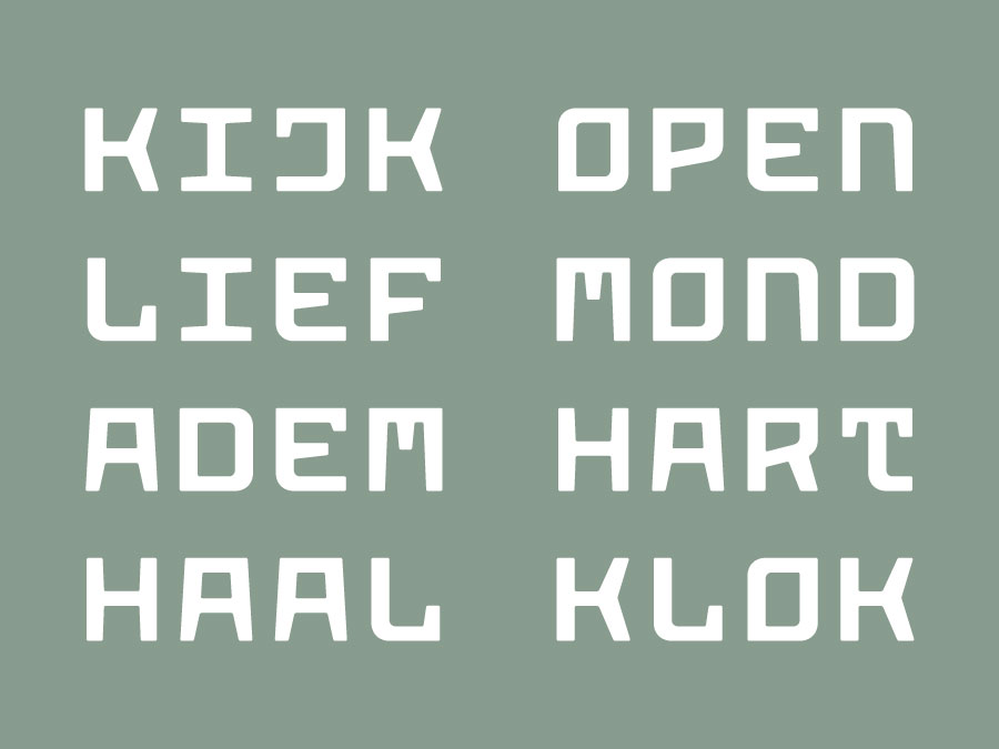
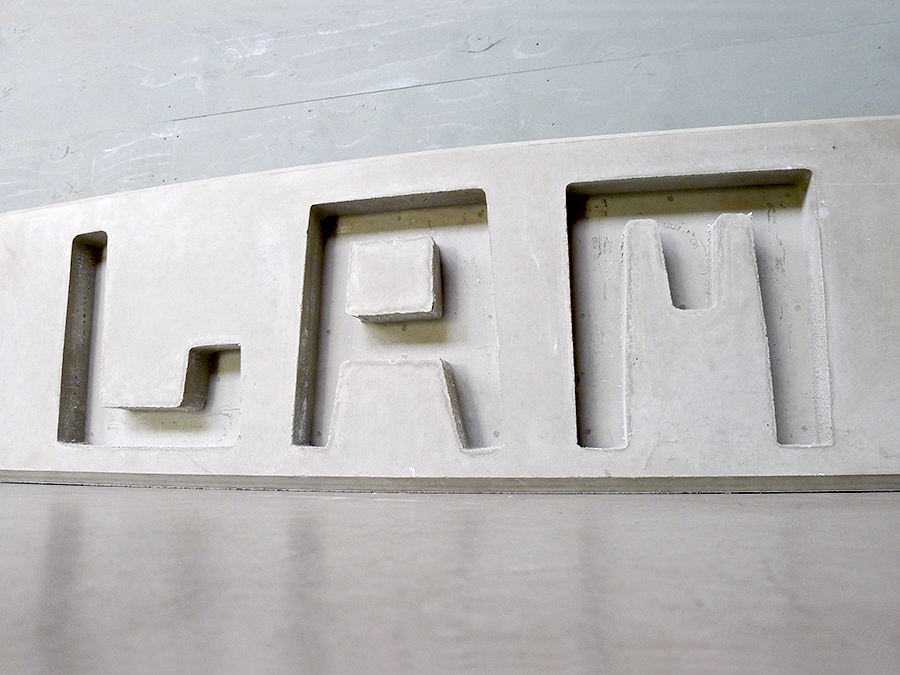
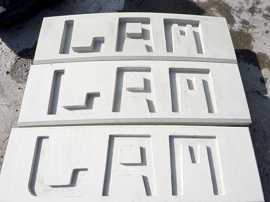
As it name implies the letters of Concrete were specifically designed to be poured in concrete. The corners in all the characters have a soft radius and there are no sharp angles. This is to prevent the concrete from chipping or crumbling in those problem zones. The tapered stroke endings, flat tops, serif-like details and unexpected angles in this striking design are reminiscent of the Amsterdam School, yet the classic style was thoughtfully re-imagined and rejuvenated. As it is a fixed-width typeface there are no spacing issues, which makes setting text effortless.