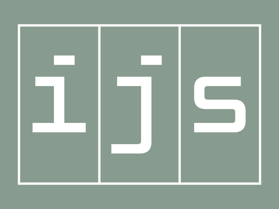
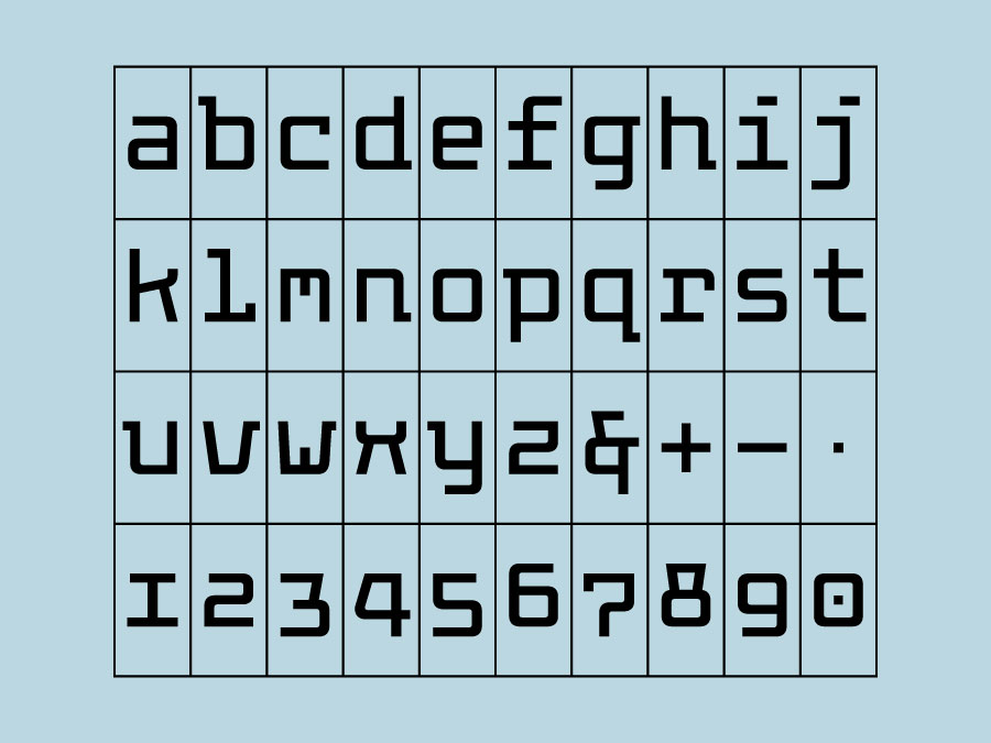
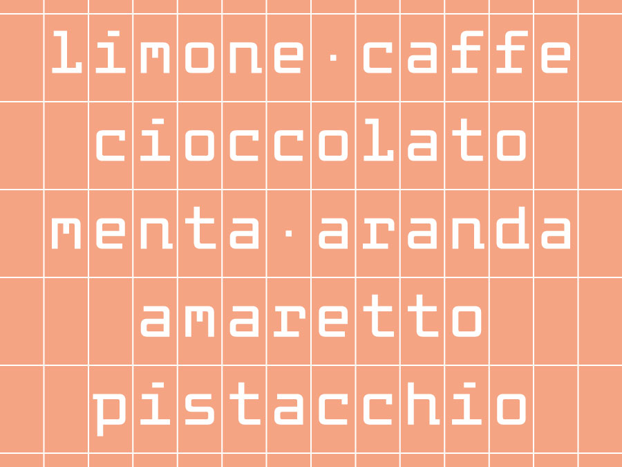
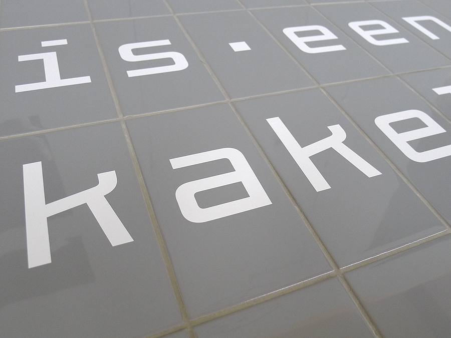
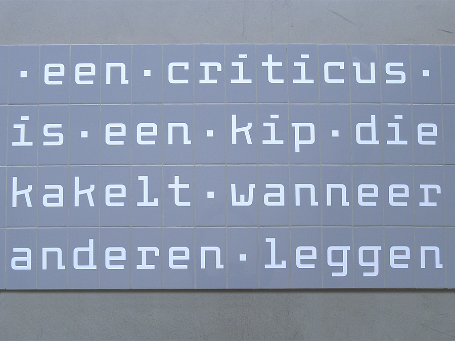
Mono Roman
Despite the fact that its letters are positioned on a strict grid, Mono Roman manages to make the viewer forget it is a fixed-width design. The ingenious construction of the letterforms makes them transcend their monospaced nature, removing the obsessive rhythm from the text image. Although the characters are constructed with only straight lines some peculiar details lend their shapes a surprising fluidity. This all-lowercase design can be used for somewhat longer texts, and is intended to be applied to Tatami tiles. The frames around the characters can easily be removed.